I want to preface this post by saying that I am not including Craigslist, or any local real estate agents’ websites. Nor am I including any FSBO listing sites. I am focusing solely on Zillow, Trulia and Realtor.com because I am most familiar with them, and they seem to be dominating the search engines for Billings keywords. Plus, it’s always fun to pick on the big guys, right? Right?
If you’re looking for a home, chances are that you will start your search online. (Those chances are even higher if you are reading this because, well, you are online right now!) According to the National Association of REALTORS, 52% of homebuyers start their search by looking online.
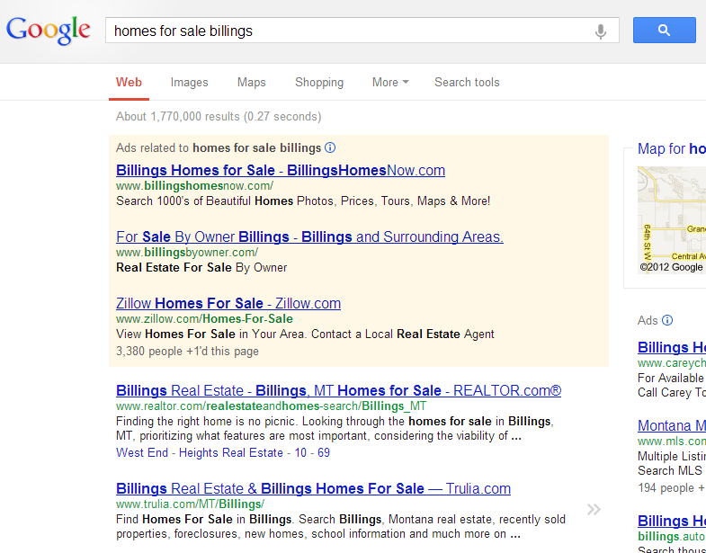
So, you’re part of the “in” crowd by deciding to look online first. But, where are you supposed to look? Well, you start with good-ol-Google, right? You search for something like “homes for sale billings” and click the first link.

Google’s results while writing this post. Results change based on your browsing history, and lots of other little things that Google factors in to show you The Most Relevant ResultsTM
If my calculations are correct, you are now on one of three websites: Trulia, Zillow or Realtor.com. Is the first listing a huge piece of land on the westend listed for a few million dollars? No? Good, then you will probably find some helpful listing information. If you answered yes, keep scrolling.
Getting to my point: where is the best place to look for Billings listings online?
The answer is…*drumroll*…my website!
All jokes aside, of the three websites that seem most popular, Trulia, Zillow and Realtor.com, which is the best? I have put together a rather informal rating based on my own views. Yes, this will be biased, but, I think you, as a homebuyer, can benefit from seeing these sites through the eyes of a REALTOR.
| Usability | Reliability | Agent Friendly | |
| Trulia | 7 | 5 | 8 |
| Zillow | 5 | 1 | 5 |
| Realtor.com | 5 | 10 | 5 |
Usability
Trulia scores the highest in usability. When I go to the homepage, my current city is already pre-selected. I can easily change it, but, since I am probably looking for local listings, this helps.
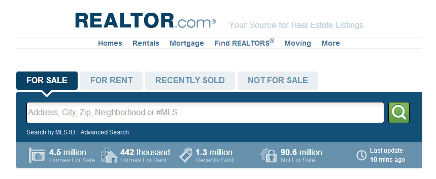
Both Zillow and Realtor.com make me type something, like a zipcode, into the search box. Realtor.com even makes me perform the extra step of clicking *gasp* on the search button after having picked the correct city from the auto-suggest box.
Realtor.com is also too busy for my liking. The first thing I see is all sorts of stats. I don’t think the number of houses listed in the U.S. is relevant to me finding a home in Billings. I want Billings info, dang it! Plus, if you are from Billings, I don’t think it helps to search by zipcode. For example, 59101 and 59102 are, in the middle of the city, more or less synonymous. If I want to live in a centrally located home, I don’t really care if it is 59101 or 59102. I think this is an example of how these “national” listing sites are severely missing the mark in smaller local markets, such as our beloved Billings, MT.
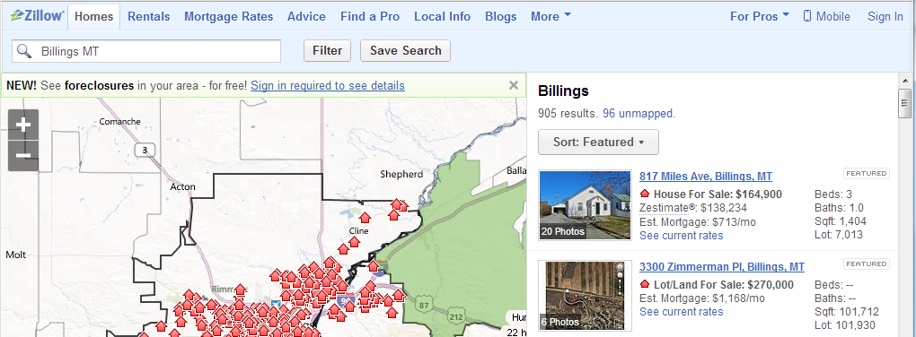
Once I actually start seeing results, Zillow takes the cake. It lays out a list of homes on the right, and a map showing all of them on the left. This way I can zoom in to where I am interested, or I can look at a comprehensive list view. This is the epitome of how I think a search result page for home listings should look, feel and function.
When it comes to actually viewing a listing, the three seem to pretty much borrow the others’ format. I suppose there are only so many ways to layout all of that information. Speaking of Information…that brings us to reliability.
Reliability
When I say reliability, I am talking about accuracy and integrity of the data. Are there missing fields, inaccurate fields, etc?

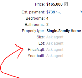
Trulia seems to be missing some data here…
Side note: I can’t draw any better on paper than I can with my mouse.
Realtor.com is the clear winner. Where Trulia and Zillow seem to consistently have price and number of bedrooms/bathrooms, Realtor.com seems to have lot size, square footage, year built, style, utility details, and more. Realtor.com best emulates an MLS print-out. It’s not that the other two sites can’t display this data, it’s a matter of simply not having it.
Since they can’t seem to automatically pull the information, it’s left up to the listing agent to manually enter it. This brings us to agent friendliness.
Agent Friendliness
Why does it matter to me if these sites are friendly to agents? I am so glad you asked! First off, at least as far as I understand, all three websites derive their income from advertising. Guess who pays for that advertising? Yep. Real estate agents. If every single real estate agent boycotted these three sites, they would most likely disappear That isn’t good for you. Though, I could make argument that it might not be that bad. But, I will save that for another blog post.
I love using Trulia. I like their agent-specific mobile app, I like their profile editing interface, I like how the green color scheme makes my hair look nice in my profile photo.
Zillow’s editing interface is fine. Nothing horrible, nothing special. Except that they don’t have one of my listings. And it has proved impossible to have it added to the site. Despite having provided their technical team with my IDX feed URL for the listing, it is still, 6 months later, just not on their site. Their technical team assured me they would “add it right away”…still waiting.
Realtor.com is an entirely different story. I tried to create an account and was told that “an account already exists for that email”. I had literally NEVER created an account, let alone even seen the login screen. Naturally, I click “Forgot Password” to attempt a reset, enter my email address and BAM! “What is your pet’s name?” First off, security questions are horribly insecure and one of the worst ways to reset a password. Secondly, I don’t have a pet. I am allergic to cats and dogs. Sadly, I will probably never have a pet. Third, I DIDN’T MAKE AN ACCOUNT. When I fail to guess “my pet’s name” I call the 800 number listed and the gentleman on the phone resets my password for me. Once I get logged in, there aren’t words to describe how ugly of an interface with which I am confronted. The font is so small I have to squint, and things aren’t even remotely labeled intuitively. I was on the edge of my seat the entire time hoping that I wasn’t going to accidentally mess something up. It is never good for someone to feel that way using a piece of software. Lastly, I had the worst experience trying to buy advertising. Not only did my sales rep fail to return my emails when I wanted to buy advertising, once I reallocated that monthly amount to Trulia and Zillow, I was getting non-stop sales calls. They would come on the weekends. They would come from multiple out-of-area numbers, unknown numbers, and restricted numbers. Quite honestly, I was just flat out ignoring non-local numbers because of these ridiculous calls. They finally stopped, but, it was at least a solid month of sales calls. I think the restricting of their number and the array of different out-of-area numbers were the most unsettling. I felt as though I was trying to be “tricked” into answering so they could make the sale.
Thanks for that, now which website should I use?
Actually, I am going to do the lame-thing and say, use all three. Since not one of them offers both an excellent user interface, and reliable data, you should probably cherry-pick the best features from each one.
Once you find a real estate agent, ask them to get you listings straight from their MLS. Those will be the most accurate listings, and a living, breathing agent will be able to offer a superior customer service experience to any website.
Do you agree with my short, somewhat biased reviews? Let me know in the comments below how you feel.


